Responding is Jeramy Hurt, CSP, ASP, director of EHS solutions, Ideagen, Pittsburgh, PA.
There are countless areas that environmental, health and safety professionals can focus on. Where to start? Visualization tools help quickly pinpoint the areas of greatest need. Safety management and EHS software products offer several types of data visualization tools, each with a distinct, complementary purpose. Here, we explore specific examples of risk visualizations in EHS technology and their role in reducing workplace incidents.
1. Heat maps and incident clusters
Heat maps are risk visualizations in EHS, pinpointing high-risk areas within a workplace using color gradients. By highlighting incident locations, near misses and hazard concentrations, heat maps unveil patterns hidden in intricate datasets, allowing organizations to allocate resources and take proactive measures to address underlying safety issues.
2. Incident tracking by injured body part
Tracking incidents based on the injured body part provides organizations with a refined understanding of safety priorities. Categorizing incidents, such as hand injuries, signals the need for enhanced risk control measures, safety protocols and improved personal protective equipment. Furthermore, this approach aids in identifying ergonomic risks, guiding adjustments in workspaces for a safer and more efficient environment.
3. Predictive analytics and risk forecasting
Predictive analytics provides actionable insights through graphs, charts and similar visual aids, harnessing past incidents and variables such as weather conditions and equipment maintenance to forecast heightened risks. Armed with this knowledge, organizations can strategically allocate resources for inspections, effectively preventing potential incidents.
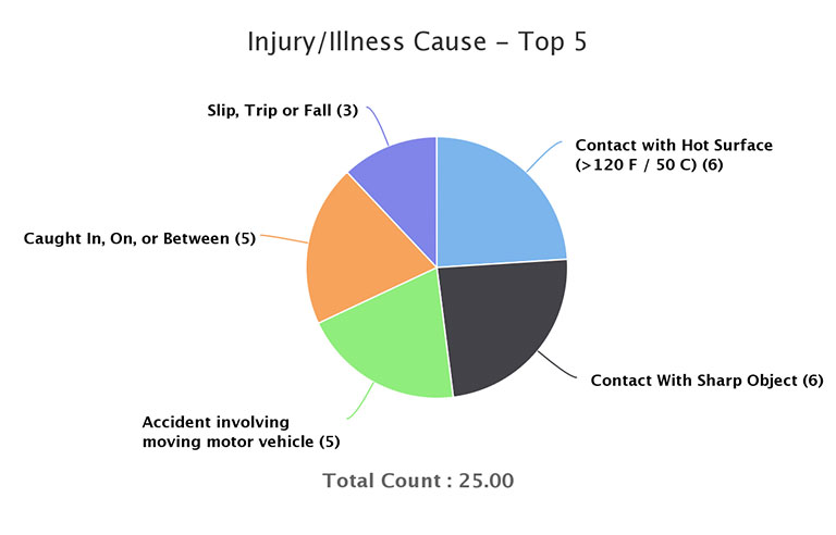
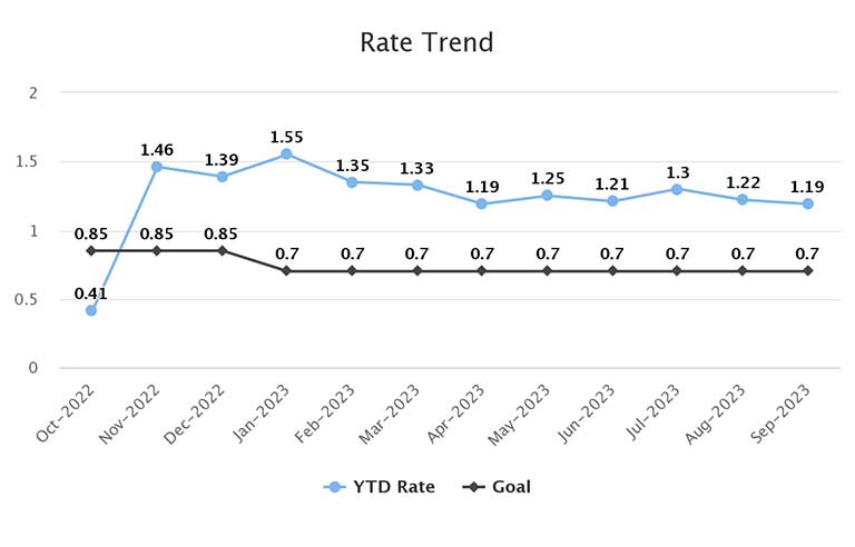
4. Incident tracking and trend analysis
Incident tracking and trend analysis are pillars of safety management, empowering safety pros with leading and lagging key performance indicator visualizations such as trend line graphs, pie charts for incident types, color-coded bar charts for action item status, geographic heat maps and Pareto charts for root causes. Issue identification is faster and more precise when safety teams can segment by region, division or facility. Interactive dashboards provide real-time incident data, nurturing a culture of continuous improvement and, ultimately, fostering a safer work environment. Visualization examples:
5. Safety observations dashboards
Safety observations dashboards provide insight into employee behavior and safety protocol adherence by displaying real-time data on safety observations, near misses and safe behaviors. These visualizations empower safety pros to identify areas where safety protocols are consistently followed and areas requiring additional training or strengthening. A data-driven approach encourages a proactive safety culture and contributes to a secure work environment.
Risk visualizations are indispensable in the dynamic world of EHS. They illuminate high-risk areas, predict impending dangers and offer real-time data for ongoing improvement. Organizations looking to create a proactive safety culture should carefully assess visualization capabilities when evaluating technology to digitize their EHS program.
Editor’s note: This article represents the independent views of the author and should not be considered a National Safety Council endorsement.