If we were to measure employers’ commitment to workplace safety, what would it look like? Would we find most employers have a great commitment to safety, or a little? Or would most employers fall somewhere in the middle, with an “average” commitment to safety?
According to OSHA, the general perception of employer commitment could be demonstrated with this graph:
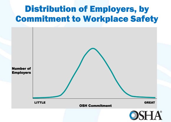
This is the “typical” model, which is to say the historical or long-held belief is that most employers’ commitment lands somewhere as average – not a great commitment, but not awful either – and very few employers have little or great commitment to safety.
What may really be the case, according to OSHA, is this:

OSHA administrator David Michaels presented both graphs during a recent speech. The second image demonstrates the agency’s belief that a greater number of employers have a greater commitment to safety than what people have historically believed. Obviously, the ideal graph would have the top of the curve as far to the right as possible, and hopefully someday we can get there.
Do you think either of these graphs are a realistic representation of employers’ commitment to workplace safety? Let me know in the comment section below.
Graph sources: OSHA
The opinions expressed in “Washington Wire” do not necessarily reflect those of the National Safety Council or affiliated local Chapters.